An Interview by Ian Bryant
Deck Published by Lo Scarabeo, June 2017
https://christopherbutler.crevado.com/healing-light-tarot
Introduction
Hopefully no introduction is needed for Christopher Butler, award-winning creator of decks like Healing Light Tarot (Lo Scarabeo), The Son Tarot (Schiffer Publishing) and the popular Quantum Tarot 2.0 (Lo Scarabeo). But in case you're just learning about him via this interview, know that he is an author and artist based in Liverpool, UK. An illustrator since his teens, Chris went freelance in 2002 working on a variety of projects, even getting some digital art mentoring in by Ciro Marchetti (of The Gilded Tarot fame). A lifelong fan of tarot, Chris has also contributed to cartomancy with the Lenormand Cartomancy deck from Schiffer Publishing. Anyone who has spent time with Chris's decks will likely feel an elevated sense of mysticism; Chris holds a Bachelor of Divinity degree from Heythrop College, University of London, which may explain some of the deep spiritual symbolism found in his work.
After
spending time with Chris's Healing Light Tarot (one of the few modern
decks I had an easy and delightful first interview with) I had to
reach out to him to learn more about the deck, why and how he created
it and to get some inside information on my favorite cards. He
was gracious enough to answer my questions and share his insight into
the making of the tarot deck and the thought (and soul) that went
into it. I hope this interview brings you to love Chris and his work
as much as I do. And if you already own the Healing Light Tarot, why not bring it out! You may look upon it in a whole new light.
The
Healing Light Tarot Q&A
Ian
Bryant: Chris,
thank you so much for doing this Q&A with me. I feel it’s
a little selfish on my end as I have had these questions I wanted
answered for a while now, but I know our Tarot Reflections readers
will also appreciate it! I’d like to start by asking if you
remember when you first had the idea for the Healing Light Tarot?
Chris
Butler: The
Healing Light Tarot had a complex genesis, its roots were in a
shelved collaborative project between myself and psychotherapist
Petronella Phillips Devaney amongst other things.
Penny
and I met in the 1990's at University and in 2014, we mooted the idea
of co-facilitating some Tarot workshops. We also talked of
co-creating a tarot deck based on the theme of Mandorla. Though the
workshops were eventually launched to great success, we never managed
to find the right form for our collaborative Tarot. I'd designed a
promotional poster for the workshops and this image of a golden
mandorla rising behind the World Tree inspired me to go my own way,
creating a mainly traditional tarot deck, but one where the healing
symbol of the mandorla featured within each card. With a little
elaboration it became the first card of the deck, aka. The World
card.
Other
images followed quickly. Some were adapted from an unfinished 2012
oracle project whilst others came from two Tarot decks I'd begun in
2010 and hit a dead end with. As with the World card, I took
elements from pre-existent images and combined them to make new
cards. The Sun, The Devil, the Wheel of Fortune, the Four of
Pentacles and the Justice cards all came about in this manner. The
High Priestess, the Empress and Death were adapted from earlier
images I'd created for a possible Film Noir style Tarot that Kay
Stopforth (writer for the Quantum Tarot) and I had discussed. A
number of Minor Arcana cards had been designed for my own attempt at
a new Tarot deck but as I now realise this was the Healing Light
Tarot waiting to happen. The time just wasn't right back then.
Looking
back, it feels like the deck has deep creative roots, going back
several years and into many different projects. It's very much the
Tarot deck I would have loved to create back in 2010 but so much more
too. I'm glad I had to wait to give birth to it and it goes to prove
you can't rush the gestation process!
Ian: You mentioned the Mandorla, or Vesica Piscis, that is featured predominantly throughout the deck. Notable appearances of this in art include early Christian art and Icons, occult and pagan symbolism, and in architectural features. When did this shape first attract you and why? What quality does it bring to the Healing Light Tarot?
Chris: It
was Penny who first introduced me to the concept of the Mandorla and
it's something that's deeply close to her heart. As a Theology
graduate, I was aware of Mandorla, especially through Christian art,
but Penny taught me to appreciate it as a living symbol of the Divine
Feminine. Although we were no longer working collaboratively, I still
wanted to weave the concept of Mandorla through my own card images
and Penny encouraged me to do so while exploring the symbol's healing
potential. It also fascinated me that this symbol, like many others
found in Christian art had a more universal existence, being found in
many pagan and occult traditions as you say. It's this universal
aspect that I wanted to celebrate the most, especially as a feminine
energy.
As
a male artist, my work is inevitably imbued with masculine energy so
the Mandorla (I hope) brings a balance and softening to those
energies within the images. I don't know if I nailed it, but I want
it to be a deck both men and women will feel drawn to energetically.
My inspiration for this lay with two of my favourite female Tarot
creators – Amy Zerner and Joanna Powell Colbert. In the Enchanted
and Gaian Tarot decks respectively, both women created deeply
'feminine' decks i.e. ones that only a woman’s perspective could
have given birth to. However, they’re ones that as a man I could
also connect with and relate to. Their decks don't trivialise
feminine energy in any way – far from it, theirs is powerful
femininity. That said, their particular kind of feminine expression
also empowers/enriches me as a man. If I could achieve only half of
what they achieved in the opposite direction, then I've succeeded.
The
Mandorla is many things. It's Goddess energy, healing energy and a
divine gateway from this world to the next. It's oval shape is
reminiscent of the female vulva so it's also a portal of birth. In
each of the images, I've placed the mandorla very deliberately, so as
to suggest where healing might seep into each Tarot archetype. I
haven't explained these placements in detail as I'd rather people
examined the cards for themselves and drew their own conclusions.
There are only two cards where no healing is suggested. In the Devil
card, the two spheres are separated, meaning no Mandorla can form
while our fears hold sway unchallenged. In the Nine of Swords, the
Mandorla is blackened in the midst of suffering. Some situations are
just plain cruel, not to mention undeserved.
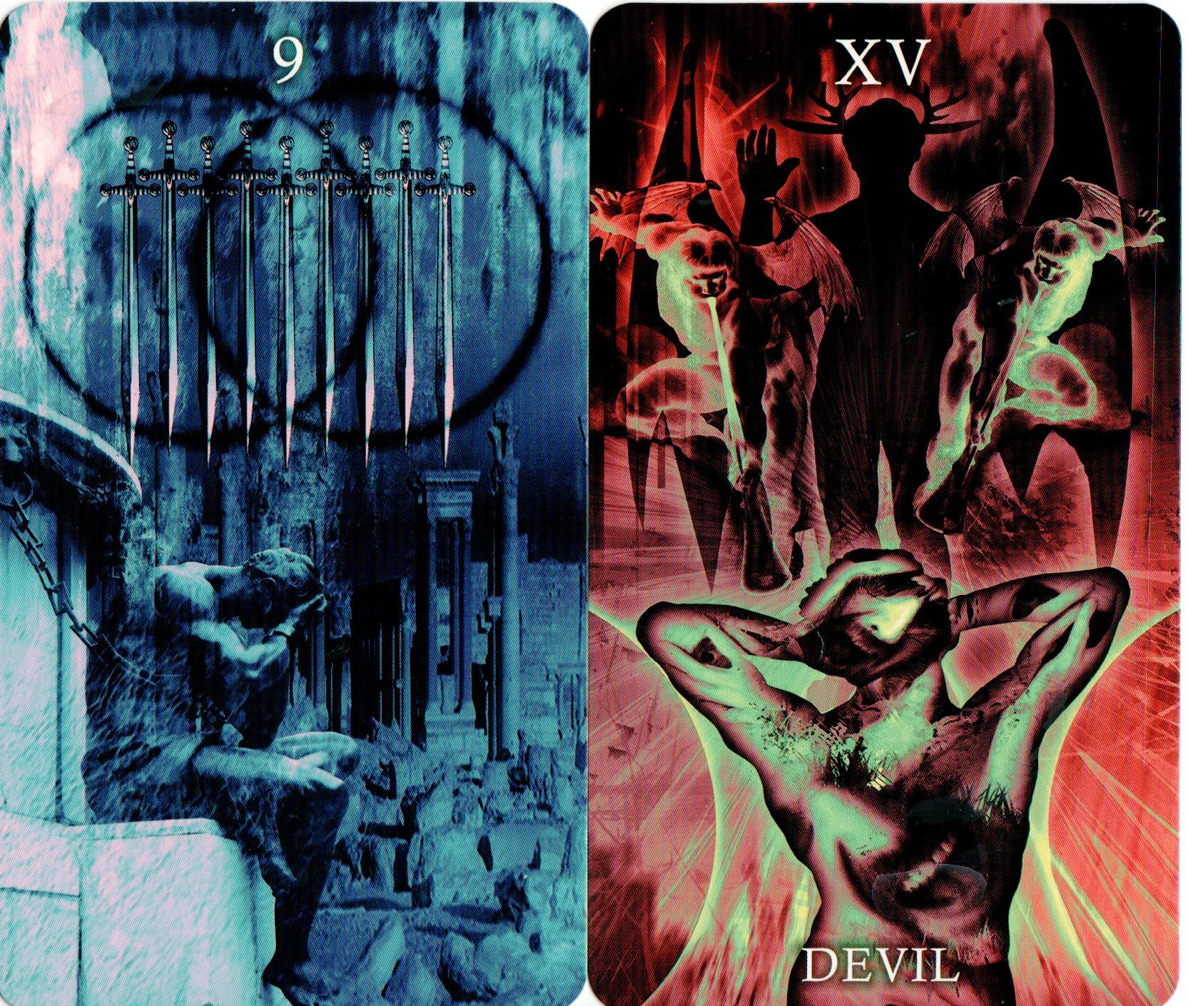
Ian: The
state of the Mandorla in the Devil and Nine of Swords is incredibly
powerful. I had to pull the cards out again to really look at
them closely. Beyond the symbolism, the art on those two cards is
also very compelling. What was your process when creating the
art for the Healing Light Tarot cards? Do you use live models,
photographs or similar forms rooted in reality to start each card?
How much work was done without technology and how much with it? And
what were your main tools and references used in the creation of this
deck?
Chris: In
a few instances I used live models who I photographed myself. The Two
of Pentacles is a good example as the model was a close friend. All I
could say was “Don't ask questions and just hold the pose. It will
all make sense when you see the card”!
In
many though, I was able to adapt figures from stock imagery,
especially as the majority of them are in silhouette. I trace around
pre-existent images in Photoshop, using the vectographic pen tool and
this allows me to store the human silhouettes as 'custom shapes'
within Photoshop. They can be recreated at the click of the mouse and
re-sized to suit without any loss of definition. Some of these were
quite mundane stock photos, but I could take the face and body
profiles and change the hairstyle, alter the shape of the clothing or
add in hats and crowns to suit. The resulting silhouettes look quite
unlike their original parent images.
Some
of the silhouettes, like the beggars on the Five of Pentacles, were
based on 19thcentury
etchings, while others came from antique drawings or photos of
statues. In a few instances silhouettes wouldn't work, so Temperance
for example is part statue and part real life human with eagles wings
added in. There aren't many cards like this but where I've broken my
own rules, I've tried to do so in a way that adds interest, enhances
meaning and disrupts any predictability. Strength and the Two of
Swords are good examples as they combine both silhouetted figures and
modified photographic elements, hopefully to positive effect.
The
deck was created using digital means, so it’s very much a child of
the 21stcentury!
Even where I used non-digital sources, such as the antique etching of
a church tower on the Tower card, they were all altered or
manipulated digitally. That's the way I work and Photoshop is very
much my medium of choice. Don't get me wrong, I enjoy drawing and
painting a great deal, and I've worked extensively as a portrait
artist in the past, but where Tarot is concerned, Photoshop allows my
imagination to take flight in a way that's otherwise impossible. What
you see on the cards comes from my heart in a spontaneous way.
Photoshop also allows you to improvise like no other medium can;
changing colours, experimenting with transparency and playing with
textures at the click of a mouse. Some people see computers as
sanitising the artistic process. I see them as an opportunity to
evoke magic.
As
for my inspirations, some are predictable, some less so. Ciro
Marchetti's decks are right up at the top of the list, mainly because
whatever I do now or in the future, he'll always be ten years ahead,
whether in artistic inspiration or technical skill. It's the same
with Karen Mahoney and Alex Ukolov of Baba Studio. Their work sets a
benchmark that all the rest of us can only aspire to.
Some
of my inspirations go right back to my teens, not least the work of
Pamela Colman Smith in the Rider Tarot (RWS) and Fergus Hall's
incredible surrealist paintings for the James Bond 007 Tarot featured
in the 1973 film 'Live and Let Die'. I doubt the Rider Tarot will
ever go out of print and Fergus Hall's deck remains in print to this
day as the Tarot of the Witches. These two, along with the Swiss 1JJ
Tarot were my first decks, bought when I was 13. They shaped how I
see the Tarot at a very deep level, especially Fergus's mischievous
re-imaginings of the Major Arcana. The twilight/time between times
aspect of my deck is very much down to Fergus Hall as I always
admired the ambiguous lighting in his landscapes. You can never tell
if it's night or day in his cards, and this gives the scenes an eerie
'in between' feel. Some even have the Sun and Moon in the sky
simultaneously, which I love.
I've
already mentioned Amy Zerner and Joanna Powell Colbert and I'd also
add the likes of Robert M. Place, Patrick Valenza, Hermann Haindl,
Nigel Jackson and Erik C. Dunne at this stage. Anyone who
combines artistic excellence with a deep understanding of Tarot
tradition gets my attention. It's not that I've set out to imitate
any one of them (and in most instances my skill levels wouldn't allow
me to). That said they've all inspired me to do my own thing
while trying to reach for something that approaches their standards
of excellence. In the end, there's no greater inspiration than
artists who always manage to do it better than you can yourself.
One
deck I really admire is the Sheridan Douglas Tarot, first published
in 1972. The fifteen year old David Sheridan’s line drawings were
deceptively simple, but the deck remains a treasure trove of symbolic
insight. The simplicity and directness of the deck shows best in
cards like the Five and Six of Wands, so much so that I decided to
pay tribute to them in the Healing Light Tarot versions. The visual
style may be radically different, but the basic symbols are the same.
Ian: I
found myself nodding as you named influences, but I have to admit the
Tarot of the Witches deck has never sat on my desk. I’m
afraid you’ve moved me to immediately get a copy of both that and
the Sheridan Douglas Tarot! I’ve long enjoyed Alfred Douglas’s
book The Tarot yet never sought out the deck for some reason.
Chris:
Let
me know when they arrive. You’ll love them!
Ian: Thank
you, you’ll be the first to know! Now, I’m sure asking this
is like asking someone who their favorite child, cat or dog is, but
I’ll ask it anyway! What are your favorite cards from the
Healing Light Tarot and why? I’m also curious which cards from the
deck were most difficult to complete? And finally, was there
anything you wished you had put into the deck after publication, or
perhaps any details of the deck you would like to have described more
in the accompanying book?
Chris: I
have a few favourites, if only because they were the ones where the
final image managed to almost match what was originally in my head! I
love the Eight of Cups. That's my homage to Pamela Colman Smith,
where I tried to follow her iconography and colour scheme closely
while still doing something of my own. I also think the Seven of Cups
worked really well – I wanted to portray the space above the
clouds, with light coming from a mandorla framed star filtering down
through the atmosphere.
The
Ace of Wands is my favourite Ace. It's overtly phallic and was
inspired by the same card from Robin Wood's deck, but I feel I was
successful in portraying libido in purely energetic terms, especially
as the phallic wand is tempered by the mandorla continuum it rests
within.
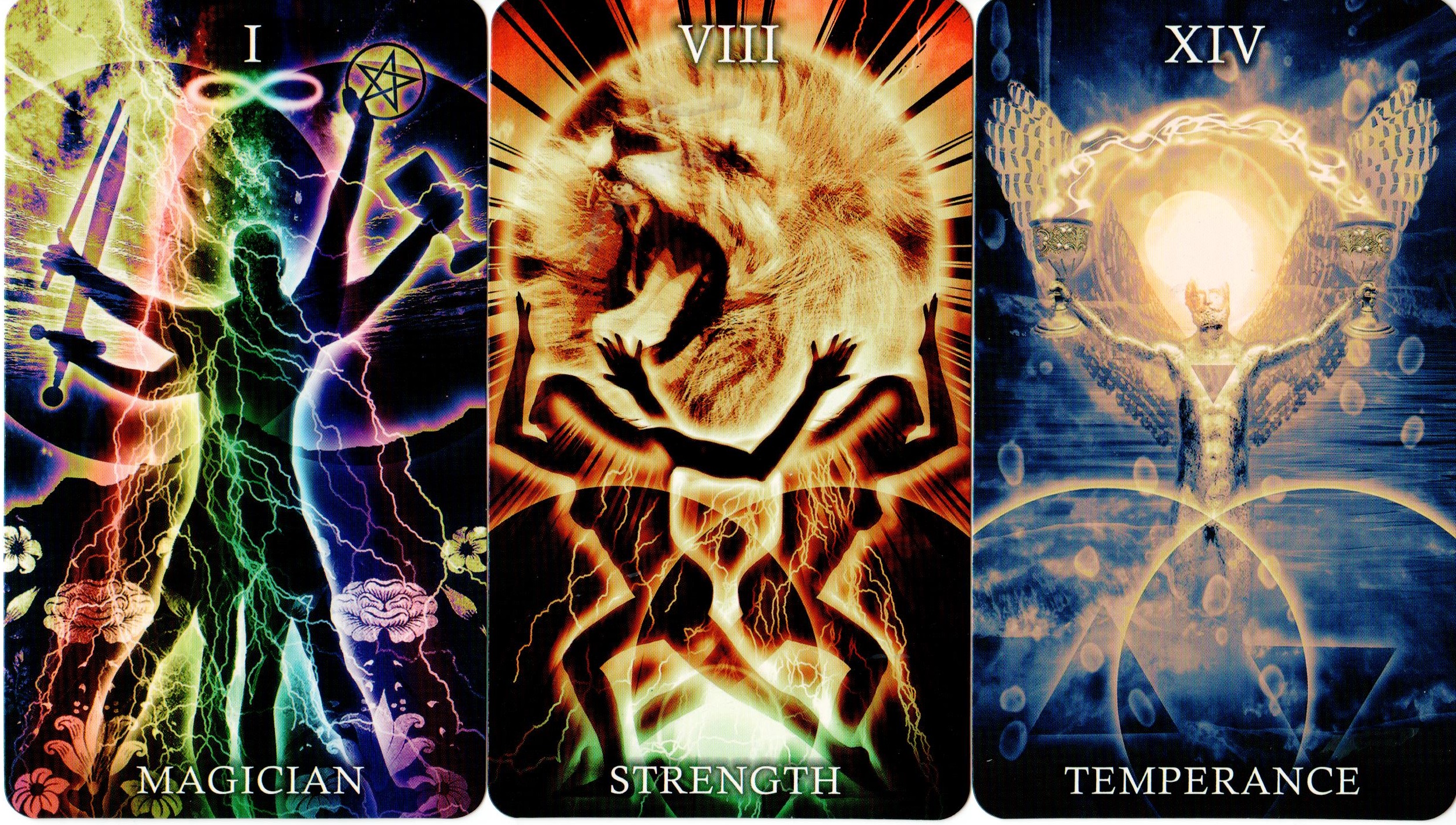
Of
the Major Arcana, The Fool, Strength and the Sun are close to my
heart. I think I managed to say something new whilst not straying too
far from tarot tradition. The Magician was the most elusive and by
far the most difficult to complete, but I’ll say more about that
shortly!
At
this stage, there isn't much I'd change, although I do wish the
publishing format had allowed for a larger, more detailed book. Where
the cards are concerned, I'd probably be more explicit in colour
coding the elemental combinations in the Court Cards. Certain cards
like the Queen of Wands are quite explicit – water of fire is
obvious in the orange and blue colour scheme. This isn't as obvious
throughout the Swords and Pentacle Courts however and that's
something I'd revise given the chance.
Ian’s Favorite Healing Light Tarot Cards
Ian: Thanks
for highlighting some of your favorite cards, Chris. Actually,
as I worked with the Healing Light tarot, I kept finding some cards
appearing more than others, and they stood out to me as I meditated
on the deck card by card. They slowly became my favorites and I
want to call those cards out here and see if there are any stories
behind them, perhaps specific influences or anecdotes, that make them
special.
Ian: “I
- Magician” - The elimination of the Magician's table intrigued me.
The manifestation of magic through the person alone, that
resourcefulness and power, inspired me. The card is electrical,
a nod to our modern magic of power and energy. The Magician is naked
and in a way becomes the table that support the magical tools.
Chris: Of
all the cards in the deck, this was by far the most difficult to
complete. It went through at least eight different transformations
before I got it right - something unusual for me as for the most part
I manage to get the basics in place fairly quickly then spend the
rest of the time experimenting with colour, texture and translucence.
Ironically, the same thing happened with the Magician for the Quantum
Tarot! Kay Stopforth and I made six separate attempts before we got
it right. I think this is down to the Magician himself - he’s
elusive, sometimes devious and not always what he appears to be. It
just took me longer than usual to uncover his true form!
My
starting point for this card were the roses and lilies featured on
the Rider Waite Magician. I sourced an amazing Mackintosh textile
design based on roses and lilies and this was to be the background. I
could see lightning and a rainbow in there but I very much wanted to
go with the red/white/yellow color scheme of the Rider card. It was
only when I realised that my Magician was closer to the Thoth Tarot
version (hence no table!) did I begin to make progress. The finished
card is more blues, lilacs and yellows and at that stage, I also
realised he would be multi-limbed (paying tribute to one of Frieda
Harris’s unused Magician illustrations for the Thoth Tarot) and
holding the suit symbols aloft. He’s had five or six different sets
of limbs along the way. I just had to keep chopping his arms and legs
off and replacing them with different ones until he began to look
natural! His legs actually belong to Leonardo Da Vinci’s Vitruvian
Man, which seems fitting, I really do see him as a superhuman. The
roses and lilies remain in the background and I’m glad the card
manages to pay tribute to both the Thoth and the Rider decks. It’s
nothing like I originally imagined but it feels right just the same.
Ian: “VIII
- Strength” - Transferring the iconography of overpowering the
“beast” to the lion being the strength itself is an important
distinction to me. The women holding it up is a sign of courage
and compassion together, both respecting this power - not holding it
at bay - and gaining strength from it, not in the combat of it. The
energy of power shines forth in this card, the feminine working
together in a community of strength.
Chris: Back
in 2002, I bought a wonderful deck (now out of print) by Adrian B
Koehli. The Adrian Tarot seemed uber modern at the time and was the
first ‘digital’ deck I’d encountered. I’ve always loved the
Strength card from this deck and it’s Adrian’s design I wanted to
pay homage to. His card shows a female weightlifter in balletic pose.
Behind her is a sphere containing the face of a lion. I wanted to
retain the sphere but if possible, make the whole image ‘crackle’
with more energy.
The
words ‘Female Atlas’ kept coming to mind while thinking about
this card and a quick Google search yielded a pencil drawing of a
naked woman holding up the sphere of the earth. When I first inserted
her outline into my image, the symmetry seemed wrong, but when I
duplicated and mirrored her, it all slotted into place, both visually
and symbolically. For me, inner strength has its conscious and
unconscious aspects and that’s what’s displayed here. They uphold
our inner lion but must also struggle to keep that wild energy
contained. The roaring lion in the sphere crackles with lightning and
glows with orange fire. By contrast, the women emerge from a Mandorla
whose inner light is a calming green. Lightning surges through them,
but their feet are rooted in a tranquil place. As you know, this is
one of my own favourites.
For
me, it sums up one of the biggest challenges the Tarot offers - how
to harness the power of the inner lion for good. How do you contain
him without taming or diminishing him? We all need the Lion’s inner
fire, but he represents one of our more dangerous energies; one it
takes all our efforts to channel constructively or to safely contain.
Ian: “XIV
- Temperance” - I felt an "As Above, So Below" vibe
in this card, with the idea of balance clearly illustrated. There
is a great sense of patience and purpose here, like Atlas supporting
the world this figure keeps everything flowing, fire and water, Yin
and Yang. There is a calmness in the colors as well as a
centered aspect to the overall design that I love.
Chris: More
than anything else, Temperance is the reconciliation of fire
(passion) and water (compassion) for me. If you can reconcile
the two within yourself, then I think you’re at the threshold of
powerful living. That’s what I set out to portray, so there are
only two main colours - the glowing gold of fire, as manifested by
the Sun, and the deep blue of water, symbolised by the triangle on
the Angel’s chest. I’ve also emphasised the theme or
reconciliation through the Mandorla. One sphere contains a fire
triangle while the other contains the water triangle. Where they
overlap, healing space is created.
This
was the one card where I knew a silhouetted figure wouldn’t work. I
knew the angel had to glow in the sunlight so I chose to have him
fully visible and fully illuminated. I also wanted him to be holding
the two cups aloft, so the liquid seems to jump backwards and
forwards between the two. It’s neither fire nor water, but
something in between, arching like a rainbow around the rising sun.
In
all the feedback I’ve had, people either love or hate this card and
there hasn’t been much in between! It is what it is - my own
personal take and to be honest, I’m not sure how successful I was,
despite being pleased with the image I created. I find this the most
enigmatic of the Major Arcana and I’m not sure I’ve managed to
adequately understand all it has to offer. Maybe I never will. I have
to say Ian, your own interpretation of this card significantly adds
to my own understanding.
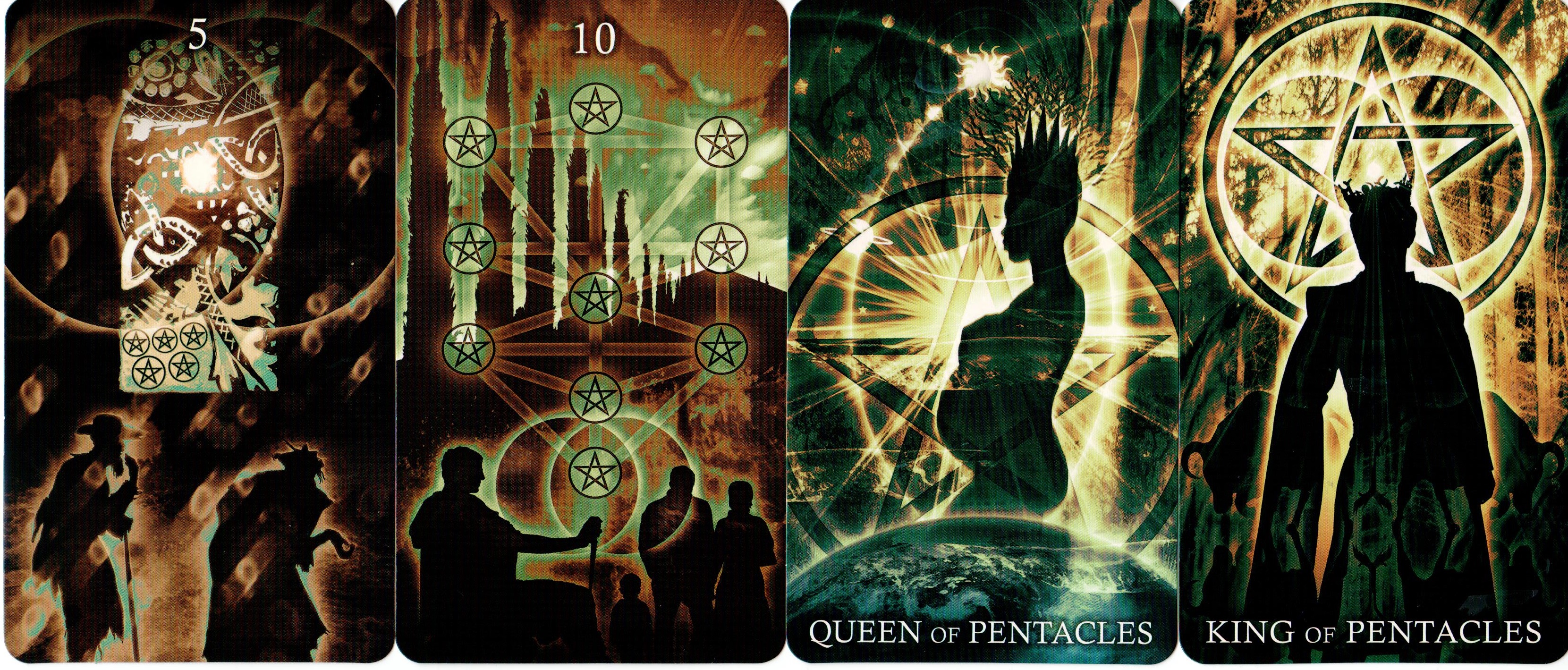
Ian: “5
of Pentacles” - This of all the cards for me had the most
familiar iconic connection to the RWS deck. All the familiar
themes are there, from poverty to isolation, worry to exclusion. Yet
in your card I also sense hope. Here are the RWS figures older
now, and rather than just a window of an opulent cathedral
highlighting their poverty, we see a portal to something better.
Chris: This
was the last card to be completed. I don’t know why I left it till
last, especially as I knew exactly how I wanted it to look from an
early stage. I also had no plan to significantly diverge from
Pamela Colman Smith’s iconography. That said, I’ve made my scene
wet and windy rather than cold and snowbound. This is purely
personal, as I find driving rain far more unpleasant that the cold
and the snow!
The
sentiment is still the same though. The glowing church window
represents sanctuary and welfare yet the two beggars remain out in
the cold. Maybe they are too scared to ask for help. Maybe
they’re so fixed on making headway through the driving rain that
they fail to see the light or even register the sanctuary that’s on
offer to them. Whatever the case, help is often at hand where we
can’t see it and our material worries can blind us to the bigger
picture. I’m glad you picked up on the ‘portal’ concept - I
deliberately wanted the Mandorla focused around the light shining
from the window.
Ian: “10
of Pentacles” - Perhaps simply for the Tree of Life being
highlighted I kept navigating to this card. In magic, what is
wealth? More than financial security it is a sense of the
metaphysical family and long-term belonging, a feeling of
contribution to the larger scheme of things. As the pentacle
can represent the five elements of magic, so the Tree of Life paths
remind us of the non-material wealth magic brings.
Chris: This
was one of the earlier cards to be completed in the suit of
Pentacles. It’s always been one of my favourites in the Rider Waite
Tarot and I love how Pamela Colman Smith chose to arrange the
Pentacles in the pattern of the Kabbalistic Tree of Life. As the Tree
symbolises Divine energy channeled from the heavenly realm to the
Earthly, I’ve always seen this card as health, wealth and happiness
channelled down through the generations.
What
I wanted to do most was to maintain the Kabbalistic symbolism, but
make it a little more explicit by showing the pathways between the
various spheres. It’s the bottom sphere of manifestation that sits
at the heart of the Mandorla in this card. For me, it’s the
generosity of shared wealth that brings about healing and wholeness.
Ian: “Queen
of Pentacles” - I have to say, this may be my favorite card
in the deck currently, this gorgeous pregnant Queen. The Divine
Feminine over the world, nurturing, providing, and continuing the
legacy of our race through the act of creation. The blue and
green tones are a reminder to us of Mother Earth who is in crisis
now, and call to mind the need to care as a mother does for our
planet or that legacy will end.
Chris: She’s
extra special to me as she was the first of the court cards to be
completed. As such, she set the tone for the other fifteen. As a
protector and nurturer, I’ve always seen her as Gaia, the Earth
Mother so I wanted to create a figure who almost emerges out of
planet Earth while growing organically. This is why her crown flowers
into the branches of a tree. I’ve also included solar system
symbolism to show her place within the wider family of the planets
and there are water textures to denote her elemental status as ‘Water
of Earth’.
She’s
not traditionally shown as being pregnant in the classic decks but I
felt it was an apt thing to portray. Gestation and motherhood are
after all, the ultimate expressions of protection and nurturing. I’ve
set her in the midst of a mandorla to show that she inhabits healing
space and guards its gateways. She facilitates safe spaces and
welcomes you in to join her. On a personal level, she represents
several of my closest friends, both male and female, for they are the
people who create a safe enough space for me to let my guard down and
just be myself without fear of judgement.
Ian: “King
of Pentacles” - I like to draw this card for inspiration. The
King of Pentacles blazes before me. This is appropriate as I have
recently returned to formal magick studies that I set aside for
purposes of work and family. I am also regaining some masculinity I
had lost and the bulls here fill me with vigor, their strength and
the authority of the King reminding me I have untapped power and
authority of my own over my lot. I have been ill some time as well,
so this deck especially reminds me it is time to heal and to stop
letting my environment determine my mental and physical health.
Chris: I’ve
always see the King of Pentacles as a wealthy patron. He’s not the
sort of King that rides out and visits his citizens. By contrast, the
doors of his palace are wide open and he invites you to hold court
with him. He’s a generous man and the key to his healing power lies
in the riches that he gives out, both wisely and freely. That’s why
the pentacle has such a prominent place above and behind him. The
card’s mandorla rests squarely within the pentacle, showing the
healing power of material generosity.
The
pentacle is almost like a window in the walls of his palace but if
you look closely, you can see the walls of the palace are forest tree
trunks and its ceiling is the leaf canopy. As a symbol of the Fire of
the Earth, he’s surrounded by a radiant glow, but the bulls in the
shadows firmly connect him to the Earthly realm and the masculine. I
found this card really difficult to portray, despite Pamela Colman
Smith making him look so easy. Sometimes you just have to accept that
the past masters knew better, and that’s why their decks are still
in print after 110 years!
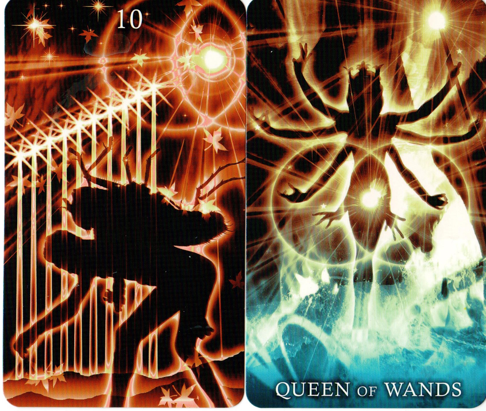
Ian: “10
of Wands” - When I first saw this card Kafka's Metamorphosis
was called to mind, although the man here is not so much transforming
but carrying the burden of the insect. Yet in a way Kafka's
book is about the weight of society, the hard work that goes into
being one thing that is your true self but having to suppress that
because of society or those around you. This is a powerful card
and a personal one for me.
Chris: This
is one of three cards where I was directly inspired by other artists’
works. I’d recently discovered the web site of an incredible
surrealist illustrator called Igor Morski and his image of a naked
man, doubled over under the weight of a giant insect tied on his back
moved me deeply. As soon as I saw Igor’s work, I knew I wanted to
pay homage to it image via my own Ten of Wands. The silhouette I
created is based directly on Igor’s illustration and for me, it
completely captures the horrific oppression the Ten of Wands is meant
to convey. This is a burden too far and one that nobody should be
carrying.
The
tips of the wands in my image all point towards the healing mandorla
and the light within. He could take any one of these staffs for
support, but first he must cast off his burden and stand tall.
Another way to look at this card is to see the insect as a grotesque
and unreasonable burden tied to his back by others. This is very
often the nature of oppression, as we suffer due to the selfishness
or cruelty of other people.
Ian: “Queen
of Wands” - Because I have traditionally seen this card as
representative of courage and confidence, especially determination
and independence, I took the figure here to be Durga from the Hindu
pantheon. She is a warrior goddess that battles evil and
demonic forces. She is a protective mother goddess opposed to all
that threatens the peace and prosperity of humanity. Also from the
Hindu pantheon is Kali who is sometimes portrayed with eight arms,
but for me Kali is too vicious to be seen in this card.
Chris: The
Queen was is also inspired by the work of a contemporary artist
called Young-Kyun
Kim.
When I saw a photo of his graceful female statue with many arms
outstretched, I knew I had to turn her into a silhouette and make her
my Queen of Wands. The Crown and her wand are my own later additions.
My primary inspiration came from the Haindl Tarot. Haindl portrayed
the Queen of Wands as Kali and although it wasn’t my intention to
exclusively draw this parallel (she’s rather fearsome as you say)!
creating a Kali like figure sums up for me the allure and danger of
this Queen’s libido energy. As for the Durga connection, I hadn’t
thought of that one but it’s totally apt!
If
anything, my card is a fusion of inspirations from three decks. It’s
the Kali energy of the Haindl deck, combined with the erotic energy
of Stevee Postman’s Cosmic Tribe Queen of Wands . By adding a
medieval crown and staff, I’ve tried to link her to the traditional
Marseilles decks and the Swiss 1JJ Tarot that I know and love so
well. She’s regal, alluring, inspirational and utterly dangerous.
That’s how I see creative energy when it’s allowed to flow
freely.
By
contrast, the Queen of Cups came directly from renaissance art as
she’s based on the Hora of Spring from Botticelli’s ‘The Birth
of Venus’. Once again, the crown was my own addition, as was the
cup, but in a similar way I immediately knew she was the essence of
my Queen and the foundation upon which to base my image.

Ian: “6
of Swords” - Something about this card really moved me.
Where the RWS card feels rooted in life, the sense of
transition, change, especially embarking on a rite of passage, comes
through so clearly in the path leading up to the journey beyond.
Part of my family mythology includes Celtic legends and the
idea of travelling through the sea to the Celtic Otherworld (Tír na
nÓg) is called to mind here. This is a very peaceful card for me.
Chris: This
was another card which I adapted from the abandoned Oracle project.
All I added was the swords and the Mandorla, whilst removing a couple
of other elements that were specific to the previous project. The
original image was black and white with an emerald green cast over
the waters; colours unsuitable for the element of air. The colours in
the final version were added by a technique called ‘gradient
mapping’, and this allowed me to duplicate the identical colour
scheme across the whole suit of Swords, with minor variations to suit
individual cards.
I
wanted to combine several elements here, mainly because I’ve never
felt the Thoth Tarot’s ‘science’ card, the Rider Waite image of
the Ferryman’s boat and the Golden Dawn’s title of ‘Earned
Success’ were that far apart from each other. The common factor is
advancement through a journey. My card pays homage to the earlier
fortune telling tradition that states the Six of Swords as a journey
over water. I was also inspired by Robert Place’s Alchemical Tarot.
I’ve put the Mandorla on the ship’s sails to show that there’s
healing in the journey’s progression. It’s one of my favourite
sword cards as it brings welcome tranquility amidst the uneasy strife
in the rest of the suit.
Ian: “2
of Cups” - This card is a special one to me, in particular
because of the Caduceus, the staff carried by Hermes in Greek
mythology (and by Hermes Trismegistus in Greco-Egyptian mythology).
I am at heart if not in disciplined practice a Hermetic
magician, student of Greco-Egyptian magic and Thelemic magic. The
ideas of love, sexual attraction and union within Thelema especially
are key. I will admit that this is maybe the only card where I
felt the Suit color went away from the impact the imagery has on me,
but that is the wonder of tarot and something to be meditated on.
Chris: I
don’t know why, but I knew from the start there would have to be
swans in the Two of Cups. When I mirrored and overlapped them in the
image, their wings formed a secondary mandorla around the couple in
the foreground. The traditional lion topped Caduceus from the Rider
Waite deck speaks of the healing power of love for me and this swan
winged mandorla just emphasised the point further. I didn’t think
too deeply when creating this card. It was one instance where my
intuition guided me best. As for the suit colour, I know what you
mean, but where this one’s concerned I knew it had to be a tranquil
aqua blue, despite the lion insisting otherwise!
Ian: “5
of Cups” - It's fitting that this is the last of my favorite
cards to ask you about. Some of the most overwhelming feelings
in my life revolve around regret and failure, disappointment in
myself and an overarching theme of pessimism about life. I
noticed once when comparing various RWS cards that this one echoed
the Hermit in a way. Yet it is almost the opposite of what the Hermit
for me always represented. And somehow in this card you have
given the man an opportunity to rise to the status of the Hermit
through a path to a structure that calls to mind the Tower of Babel,
a path to the beyond. Like all your cards, I am called to
recall negative aspects of my life but I am not left floundering -
you give me a way to the Light. This card could be the poster child
for what your deck represents, that initial stance of defeat but a
path to something better on the horizon which could be yours if you
would just get up and head to it.
Chris: Believe
it or not, the figure looking deflated and regretful at the front of
this card is a silhouette of Michael Phelps resting at the poolside!
He’s such a statuesque and graceful man and I knew his form would
give me exactly what I wanted to create for this card.
The
symbolism I’ve adopted is mainstream Rider Waite for the most part,
but I wanted to add a sense that the card was a journey,
involving losses and gains along the way. As such, the man’s path
follows a coastal causeway with rough seas on either side. The
tower within the mandorla marks the end of his journey. It’s a
spectacular, almost mythical building, similar to the towers shown in
the Moon card and it’s definitely somewhere that you’d want to
reach and explore. It’s place in the mandorla shows that there’s
meaning, purpose and healing at the end of this journey. It’s one
of the most bittersweet cards in the deck, especially as the
protagonist has much to lament in the spilled contents of the first
three cups. If they represent his energy and determination, then the
lion’s share of it has been spent. That said, the two remaining
cups hold enough for the remainder of the journey and the goal is in
sight.
The
idea was to create an image that would give hope when you’re at the
end of your tether. Maybe it was more than Michael Phelps's
graceful beauty that made me include his outline on the card.
Athletes persevere and athletes never give up until they’ve won the
race.
Closing Words
Ian: Chris,
I want to thank you for such an illuminating dialogue on your deck
The Healing Light Tarot. I know for me it has led me to a
deeper appreciation of the deck and also of your work in general. If
I did not say it already, the “healing” aspect of this tarot
really has had an impact on me. I found myself contemplating
much pain in my life, but coming away empowered and optimistic.
Unlike many of my tarot decks, I actually keep this one at hand
specifically for that feeling, for that work that goes into facing
tough memories but coming out on the other side in some way healed.
Your use of Michael Phelps is very fitting in considering the
attitude towards life I hope everyone who picks up this deck and
really works with it comes away with. I truly look forward to using
more of your decks and seeing where your work leads you. Any closing
thoughts to leave our Tarot Reflections readers with?
Chris: Thanks
so much Ian; not just for giving me this opportunity to talk about
the deck, but for all your encouragement as well. I’ve had so much
joy from creating my decks, but knowing that they touch other people
makes it so much more worthwhile, especially when they’ve become
part of a person’s healing journey as with you. I’ve been deeply
touched by your comments.
The
healing aspect of this Tarot deck is highly significant as you
mentioned. Working with the Tarot (through reading, meditation and
deck creation) brought about deep healing in my own life. In my late
teens and twenties, I was subjected to Gay Cure Therapy and a variety
of other Religious abuses via a number of Churches and Christian
Organisations. By my mid thirties I’d extricated myself but was
left with shattered self esteem, shed loads of trauma to be processed
and very little inner confidence. Working with the Tarot archetypes
was literally my therapy. They helped me to see the real me and learn
to love myself for the first time. Most of all, they helped to show
who I could become, and that journey is ongoing.
Creating
my gay men’s deck, The Son Tarot was the greatest part of this
process, and in many ways it’s the visual diary of my becoming. By
writing the companion book, I learned not just to accept being a gay
man, but also to celebrate it. The Healing Light Tarot is important
in my story as it extends my appreciation of the Tarot’s
transformative potential to everyone. I’m both living and walking
proof that Tarot Archetypes can change people. If working with the
Healing Light Tarot facilitates a similar journey for just one
person, then I’ve done my job.
The Son Tarot: Mysticism, Meditation and Divination for Gay Men is published by Schiffer.
ISBN: 978-0-7643-4227-1
The
Healing Light Tarot is published by Lo Scarabeo.
ISBN: 978-8-8652-7487-3
The
Healing Light Lenormand, companion to the Healing Light Tarot will be
published by Lo Scarabeo in May 2019 (Europe) and September 2019
(United States).
ISBN: 978-8-8652-7607-5