Tarot of Prague, 3rd Revised Edition
Review by Richard Avila
Limited Edition Large Format
Standard Size
Revised Tarot of Prague companion book
Written/designed by Karen Mahony
Illustrated/designed by Alex Ukolov
Publisher: Magical Realist Press
Book ISBN: 978-1-905572-19-9
The original Tarot of Prague was released in 2003 to great acclaim. It was named Aeclectic Forum’s Deck Of The Year, and since then has become a highly sought after item selling for hundreds of dollars. Baba Studios went on to publish other popular decks, including Bohemian Cats, Bohemian Gothic, Victorian Romantic, and more recently, the Alice Tarot. These too proved very popular, but the one that got the proverbial ball rolling was Tarot of Prague.
Earlier this year, Baba released Tarot of Prague (ToP) 3rd Revised Edition, which began shipping last month to lucky buyers. This edition was released in a limited edition large format, and a smaller standard size. According to the Baba Studios website, some changes have been made. These relate mainly to improving the clarity and color of the images. The biggest overall change is probably the addition of a metallic overlay to the cards, which becomes visible depending on the position of cards under light. The change is striking, and gives the cards greater vibrance.
The decision to print a new edition was prompted by the decision to offer a tour of the city of Prague - the Magic Prague tour - which took place last month. Decks were needed for tour participants, and so the new edition came into being. The Limited Edition Large Format was printed in a run of 750, and the Standard Size in a run of 1500. Both versions come with a 31 page Little White Book, and both decks are printed on 320 gram paper with a carbon inner layer. Both sets of cards have rounded corners.
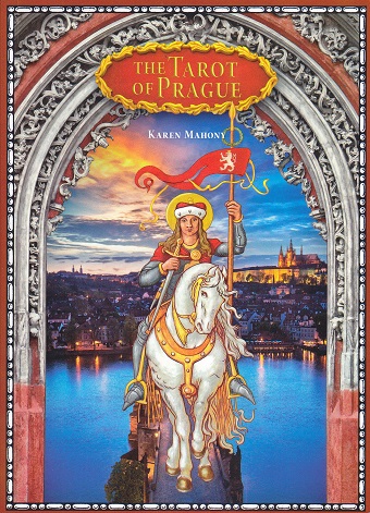
The Large Format deck is definitely large: the cards are 6.5”x4”. They come in a hinged box measuring 8”x6”x1.5”. The cover of the box is the Knight of Wands with the city visible behind him. In the box is the deck, and an additional title card, numbered and signed by the designers. The back of the Large Format deck is done in silver. This deck also shipped with a large and colorful scarf as part of the package.
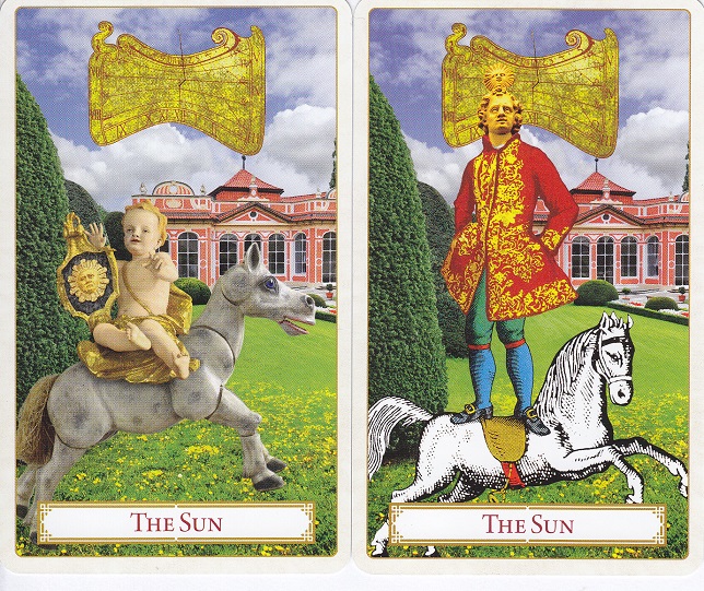
Moving on to the Standard Size: cards in this deck are 3”x5”. They too come in a hinged box, approximately 5.5”x3.5”x1.5”. The box is blue, and the image on the front is the Moon. Backs of these cards are gold, as opposed to the silver of the larger edition. Aside from that, the design is the same. There are extra cards included here. There is an alternate Death card, an alternate Sun card, and a title card. Both versions of the Sun card are shown here, as is the back of the Standard Size deck.
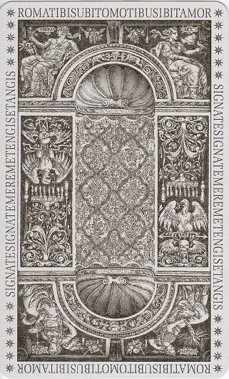
The design on the card back is reversible. The edges of the back have Latin palindromes on them. The top and the bottom say: ‘ROMATIBISUBITOMOTIBUSIBITAMOR’. If we separate the words, we get: ‘Roma tibi subito motibus ibit amor’. This can be roughly translated as – in Rome, with its bustle, you will find love. The sides of the cards have another palindrome: ‘SIGNATESIGNATEMEREMETENGISETANGIS’. I am not enough of a scholar to properly separate the words, but the (again, rough) translation is - Reveal yourself in the form of a sign; in vain you reach for me, I am your desire. Both phrases are taken from a tower near the Charles Bridge.
The Prague deck is clearly based on the Rider Waite, but with images and backgrounds taken from objects or locations in the city of Prague. Because of the many sources for the images, there is less of a unifying style than a unifying theme. Some of the images are Art Nouveau, some medieval, and a few are modern. However, anyone who has spent time in Prague will quickly recognize the Golden Lane, Charles Bridge, and Strahov Monastery in the cards. The images are indeed clear, colorful, and the metallic stamping gives them additional brilliance. While the card backs make liberal use of the stamping, on the front of the cards it is used more sparingly; usually to highlight a specific person or object.
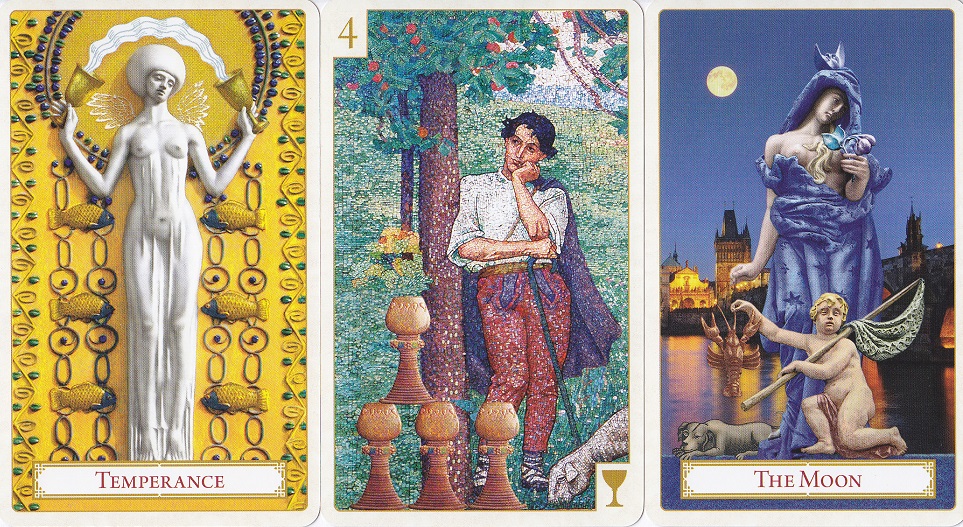
The Major Arcana follows the standard format; however, in this deck they are unnumbered. Particular standouts are the Hermit, Temperance, and the Moon. The Moon is a statue clothed in a blue shawl, with the Charles Bridge pictured at night behind her. Temperance is a carving taken from the façade of a building on Kaprova Street. She is in white, and the background is in yellow. The Hermit wears a red robe and walks down the Golden Lane at twilight with his lamp before him.
The minor arcana are easily as captivating as the Majors. The symbols of each suit are located on the bottom right corner of the cards, while the card number is located on the top left. The symbols on the bottom right corner all look the same, but in the card images the symbols are not uniform. The Cups may appear as metal goblets, porcelain goblets, or even mugs of beer. The Swords are the same on the first four cards, but then the type of sword changes depending upon the image.
Without a doubt, the 3rd Edition, whether Large Format or Standard Size, is beautiful. A great deal of care and effort went into the making of this deck, and it shows. I am not familiar enough with the prior editions to make a comparison, but on its own this deck is a work of art. Now that one is in my possession, it becomes clear why the earlier editions became so sought after in the last decade or so.
Aside from the deck however, we still need to take a look at the revised companion book. It is 256 pages long, measures 8”x6”x.5”, and is printed on glossy paper. It is amply illustrated with black and white images throughout. There are sections devoted to each suit, to spreads, and other sections which discuss prominent people or places in the city. For example, there are sections on the Golden Lane, Charles Bridge, and Libuse, the mythical queen who founded the city.
Every card is discussed in some depth. Card discussions are divided ino three parts: short interpretation, fuller interpretation, and source. The short interpretation is equivalent to what is found in the LWB. The fuller interpretation is usually several paragraphs, and the source section lists what type of image the card came from (statue, painting, building façade, etc.), and where that image can be found in the city itself. To me this part was most interesting, because the locations are specific and make it fairly easy to find the originals.
The retail price on the website for the Large Format edition is $155, but as of 17 May 2016, it is listed as “temporarily unavailable”. The Standard Size retails for $86 and as of 17 May 2016 is still available. The price is outside the norm for Tarot decks, but again, this particular deck has proven quite popular over the last 12 years or so, and at the time of writing both sizes of the 3rd Edition retailed for less – much less - than prior editions available via Ebay or Amazon. All in all, this is less a deck than an object of art that time has seasoned and proven true. If you want it, grab it while it is still available.